Validation
Validate that the expected outcome occurred
When testing an app, it isn’t enough just to know that the steps ran effectively. In many cases, you will also want to verify that the expected result was produced by the test step. For example, after logging in, you may want to verify that the correct username is now shown in the page header.
The following types of validations are available:
- Page Accessibility Validation – Validate page accessibility.
- Element Accessibility Validation – Validate page element accessibility.
- Validate Element Visualization – Record file upload interactions.
- Validate Viewport Visualization – Record file upload interactions.
- Validate Full Page Visualization – Record file upload interactions.
- Wait for Element Visualization – Record file upload interactions.
- Validate element visible – Validate that the expected element is visible.
- Validate element not visible – Validate that an element is not visible.
- Validate element text – Validate that the expected text is visible.
- Add custom validation – Create complex validations using custom scripts.
- Validate using custom code – Create a test step with custom code.
- Validate download – Validate that the download content is as expected.
- Validate email – Validate sign-up and login flows.
- Validate CSS property – Validate any CSS property of an element.
- Validate HTML attribute – Validate any HTML attribute in your app.
- Validate checkbox – Validate whether a checkbox is checked or unchecked.
- Validate radio button – Validate whether a radio button is checked or unchecked.
- Validate API – Validate API response values against elements in the UI.
- Visual validation (element, viewport, full-page) – Validate visual details down to the pixel level.
- Add network validation – Validate that network requests were executed as expected.
- Add CLI validations and actions – Execute node.js scripts from within your tests.
- File upload step validation – Record file upload interactions.
- MonboDB validation – Validate MongoDB using a CLI action step.
- My SQL validation – Validate MySQL using a CLI action step and SQL queries.
Validation Step Display
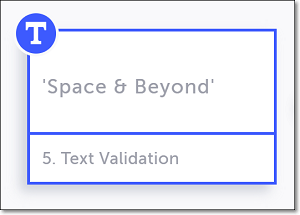
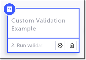
When you add a validation step, it is shown in the Editor as a new step in your test, indicated by an icon in the upper-left corner of the test step. Each type of validation step is represented by a different icon. The following are a few examples of the icons shown for various types of validations.
Validate element visible

Validate element text

Custom validation

Validation Test Results
When you run your test, each validation step will either pass or fail depending on whether or not the validation criteria were met.
If the validation step passes, the icon in the upper-left of the test step is shown in green, and there is a message in the Properties panel showing that it passed.

If a validation step fails, the icon in the upper-left corner of the test step turns red, and there is a message in the Properties panel showing that the step failed. Additionally, a red bar will appear at the top of the Editor indicating that the step failed. The red bar shows the expected and actual values for the failed step. There is also a See error link that can be clicked in order to open the full error message.

For more information, see Test results.
Updated over 1 year ago
